Typography has endless importance to a book’s cover design. The fact is, your book’s cover design can survive (and even thrive) without photography. It can’t without typography.
For this reason, it’s vital to familiarize yourself with how type is used in so many cover designs today and how to choose the typography that’s right for your story.
Being revolutionized with the advent of the printing press, typography has grown from simple static letters to an art form meant to express and compliment the text it embodies.
Let’s take a closer look at why typography matters in your book cover design and how to choose the typography that accurately reflects the themes of your story.
Why typography matters in book cover design
When it comes to an effective book cover design, there are three main components: clarity, accuracy, and intrigue. The more a book’s design captures these three elements, the more effective it will be in appealing to its target market. As you may have guessed, typography plays a massive role in this.
The job of book cover typography is first and foremost to communicate to onlookers the title, subtitle (sometimes left off of fiction books), and the author’s name. However, unlike the text of the book, it’s not only there to be read, but to accentuate the overall feel and style of the composition.
To use an analogy: imagine a stranger came up to you with a troubled and saddened countenance and stated, “I cannot believe this happened, it’s beyond belief!” Upon inquiring of the statement, you would likely expect the news following to be tragic or unhappy.
Imagine then that another person came up to you stating the same words, but rather than appearing remorseful, jumped up and down in happiness and glee. When questioning, it’s likely in this case you would expect good news to follow.
See the difference? In everyday conversation, tone and body language plays a huge role in spoken communication—far above the words themselves.
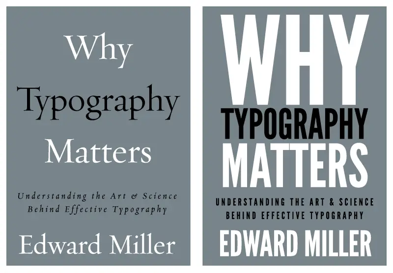
The same applies to typography. The look and feel of a book’s cover design can change dramatically utilizing the same title only with differing typefaces and styles.
This simple example illustrates the dramatic different simple typographical changes can make on a design with identical text.
The basics: Types of letterforms
When it comes to the basics of typography, there’s a wide variety of ways we can classify type (or fonts).
Here’s a mainstream, pretty commonly-used categories for letterforms (via fonts.com):
Serif Type Styles
- Old Style
- Transitional
- Neoclassical & Didone
- Slab
- Clarendon
- Glyphic
Sans Serif Type Styles
- Grotesque
- Square
- Humanistic
- Geometric
Script Type Styles
- Formal
- Casual
- Calligraphic
- Blackletter & Lombardic
Decorative
- Grunge
- Psychedelic
- Graffiti
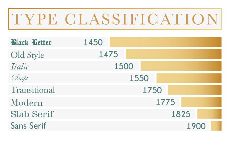
Here’s a more historical look at some type classifications:
Covers with a typographical emphasis
As you might imagine, there’s seldom a book cover design that doesn’t leverage strong typography as a design asset. However, with more modern, minimalistic styles hitting the market in larger numbers, the emphasis on quality typography has come more and more to the forefront.
As such, here’s a collection of fairly recent book designs that rely heavily on a typographical focus:
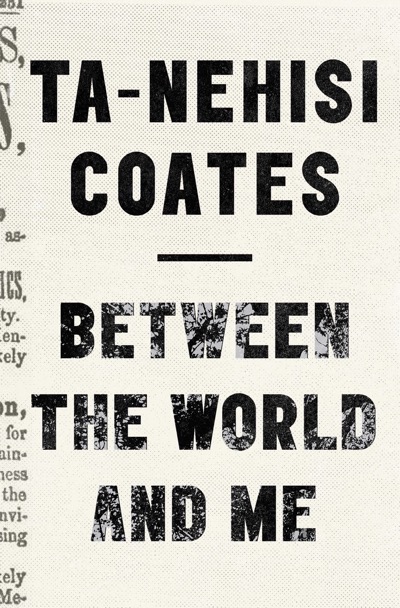
This retro, newspaper-isn design relies solely upon typography to convey its message to readers.
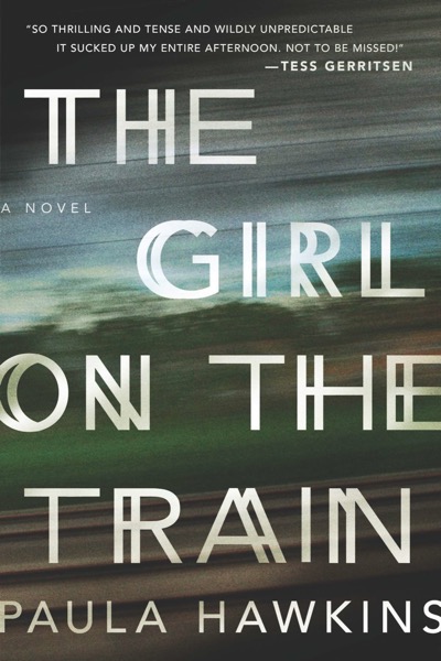
Incorporating a blurred background, the distressed type of this cover conveys a more frantic overall style.
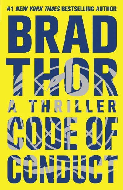
Utilizing big, bold typography, this title allows iconography to show through while making the type the emphasis.
Relying almost exclusively on type, this design makes one exception with the man running toward the reader substituting the “I” in “Die.”

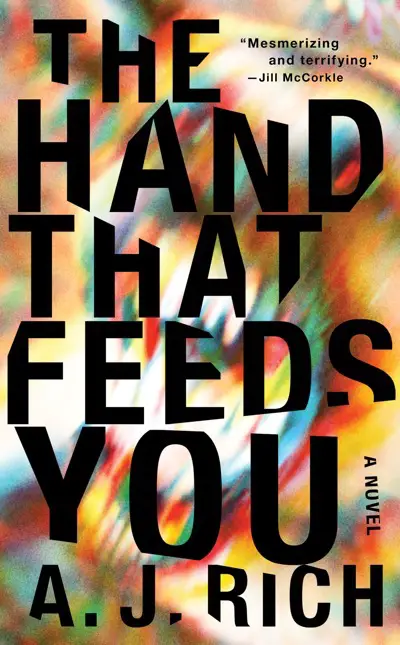
With a swirling and almost dizzying background, this typography is heavily modified to accentuate the feeling of movement given with the backdrop.
In a unique and nearly off-beat, style, this illustrative typography pushes beyond a standard typeface to something altogether unique.

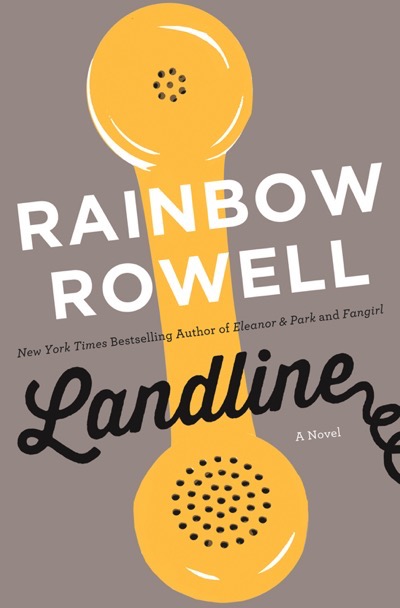
In some cases, the typography becomes part of the illustration as is the case with this book cover design.
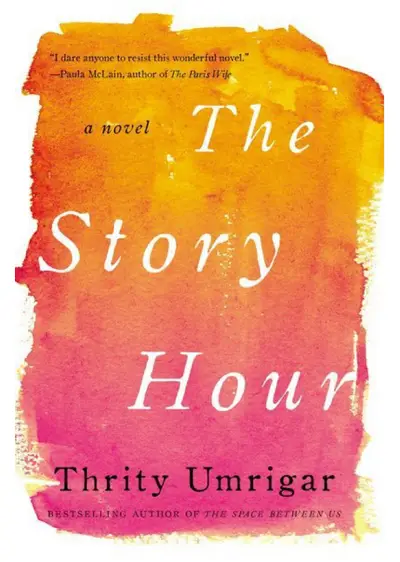
As is the case with this design, having a typographical focus doesn’t always require the typography to take up an extraordinary percentage of the cover.

With a “smudged” or rough edge typeface, the type in this cover help give the illusion of masked off portions of the surrounding watercolor painting.
The art of book cover typography
With everything said, hopefully, you’re well on your way to understanding the importance of the art that is book cover typography. So important is it in today’s design world, that many argue it should be the foundation of every medium of design—as in many cases—it has become so.
In any case, is there a particular typeface you prefer? Any you’ve avoided? Feel free to leave a comment on this article to share your thoughts!


2 thoughts on “Want To Sell More Books? Know Your Book Cover Typography”
Nice! I’ve been experimenting on different typefaces and styles for book covers. I generally love Serif styles as they can give that serious, dark, or magical feel. And each genre requires diff. types. Definitely bookmarking this article for future use!
Thanks so much—glad you found it useful!