Designing your book’s cover can be so many things: a labor of love, an ego trip, an uphill struggle, but what it should be is an attempt to communicate.
In this article, I’ll look at some covers of famous works and explore what makes them work (or what ensures they don’t) and what they can illustrate to authors and artists about their own designs, and the type of communication that’s most effective for turning browsers into buyers.
#5 – A Chapter of Hats and Other Stories by Machado De Assis
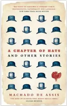
The stories collected in A Chapter of Hats are examinations of the human condition presented in a darkly humorous style. A Brazilian writer more than 100 years dead, De Assis uses surgical wit to present a series of quasi-absurdities but always with a sincere and considered intent.
This use of humour is perfectly encapsulated on the modern front cover. One hat is of a different design and color, made comically strange, and yet the reader can’t immediately grasp the relevance. The illustrative style is dated, and the paper is given a deliberately aged appearance. The font communicates the formality of age and yet still communicates a degree of self-knowing humor – a change of color and it could be used on a circus frontage.
The illustration embodies the same kind of dry, dark wit that the reader can expect inside. It also asks them to be curious and open minded. ‘What is the significance of the hats?’ is the bait. If the question intrigues rather than irks you, you’re more likely to be the kind of person who’ll give an old book by a foreign author due consideration.
Of course not everyone can get a bespoke illustration for their cover, but what this example shows is what covers do for readers. The cover advertises the experience the reader can expect. When a reader browses for books that’s really what they’re looking for. Covers can help to suggest plot, genre and tone, and they should, but all of these factors are still just indicators for the emotional effect a book will have on the reader.
Will they cry, laugh, be fascinated? Define at its simplest level the emotional relationship you want readers to have with your book and base your cover on that. De Assis’ cover promises wit and intellectual stimulation, but this works just as well no matter what your subject…
#4 – A Walk to Remember by Nicholas Sparks

Nicholas Sparks might not be universally celebrated, but he knows exactly what his audience wants. This cover leaves the reader in no doubt of the subject or of the emotional experience they can expect.
Authors love complicated covers that communicate every facet of their vision but this can be more egotism than practicality. Your number one goal when designing a cover is to produce an end result that communicates tone, genre and emotional experience. The cover doesn’t exist in a vacuum, it has constant back-up from your blurb and first chapter. The blurb intrigues your reader and the first chapter lets them know if they’ll enjoy your style. All the cover has to do is get the reader as far as the blurb.
Your number one goal when designing a cover is to communicate tone, genre and emotional experience.Click To TweetImagine you’ve been set a challenge. You have to run up to a book display and bring back a romance novel as quickly as possible. No matter what else is on the shelf you’ll almost definitely grab A Walk to Remember because it screams what it’s about. That’s the kind of cover you want. Real readers aren’t on a timer but if a book is that clear about what it’s offering then they’ll check it out. Building their intrigue from that point is the blurb’s job, the cover just needs to get the book in their hand.
We’ve all seen esoteric books with weird, interesting covers but ‘weird and interesting’ are what those books are offering. If what you’re offering is suspense and what you advertise is surrealism then readers will quickly get over your arty cover.
Having identified that covers should communicate the experience of the book in a way that gets the reader to the blurb (however obvious you have to be about it), let’s take a look at a bad cover.
#3 – The Discworld Series by Terry Pratchett
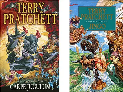
Terry Pratchett’s Discworld series could be described as soft fantasy. There are dwarves and trolls and heroes, yet they’re set in a satirical world which is more a pastiche of fantasy writing than fantasy itself.
While the early covers for his books show undeniable artistry they inaccurately communicate the books as hard fantasy. Not just fantasy in their own right, but fantasy for people who are already deeply interested in the genre. Contrary to Pratchett’s colloquial, gentle style they’re almost aggressively busy. They challenge the reader’s comfort and exclude those who don’t feel welcome. The reason that these covers don’t work to advertise their books is a fundamental lack of communication between author and illustrator.
Good old Josh. I miss him – because we had so many arguments. Because he did lovely work, absolutely wonderful work, if I ever criticized in the tiniest little way he said ‘I’ll do the pictures, and you’ll do the words’.
– Terry Pratchett
While this might be a satisfactory arrangement between two artists, it treats the cover as a separate work tangentially linked to the book rather than as a concerted effort to get the reader to the blurb.
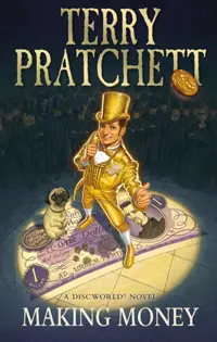
Later covers drawn by Paul Kidby are far less busy, and more communicative of Pratchett’s soft fantasy style.
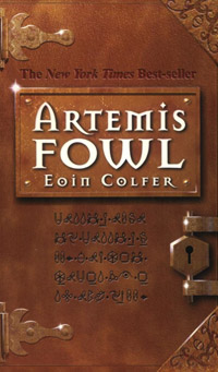
#2 – Artemis Fowl by Eoin Colfer
Of course it’s easy to say ‘show your audience what the book will do for them’, but you can only do that once you’re acquainted with the visual language of book covers. The easiest way to do this is to gather a hundred or so popular books from your genre of choice and try to identify patterns between them.
We’ve shown you this image before to highlight the visual language of thrillers, but it bears repeating:
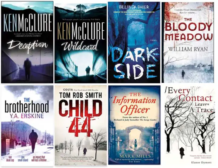
They may seem a little samey, but readers looking for a thriller can spot them a mile off. One example of a cover design which really gets its audience is Eoin Colfer’s Artemis Fowl. The cover art, of a mysterious locked book, both communicates that the novel will be a fantasy/mystery but also challenges a young reader, a demographic to whom nothing is more tempting than being told they can’t have something. A ‘locked’ book is one they have to open.
Like the following cover for Anthony McGowan’s Hellbent, which warns readers that the book may be too disgusting for them, the cover understands its potential readers and caters to their mindset.

Robert Muchamore’s Cherub series has had similar success with a series logo imprinted on a simple but compelling background image.
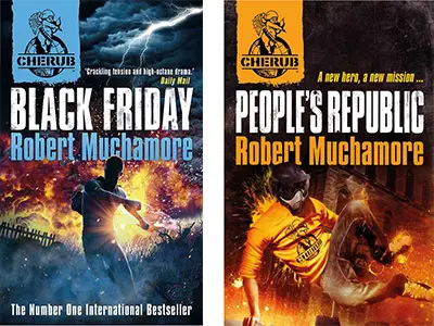
Younger readers have a very advanced visual language when it comes to logos and brands, and Muchamore’s appreciation of this allows him to make the simple but important statement ‘this is for you’.
With the electronic reader now common it might be that the need for this statement fades with time, but right now it’s alive and kicking. It’s why J.K. Rowling and Terry Pratchett released adult covers for their books and saw an increase in sales. Learn the images your reader is comfortable with then use them to communicate what your book is about and who it’s for.
J.K. Rowling and Terry Pratchett released adult covers for their books and saw an increase in sales.Click To Tweet#1 – Penguin classic book covers
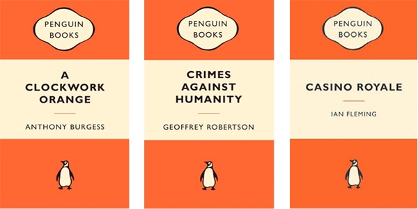
What do book covers that hardly vary have to tell authors about cover design? Well, first of all it’s important to note that these covers fulfill all the criteria so far. They’re not advertising the story inside but the idea that you should have read this book. They know their audience exactly, they advertise intellectual satisfaction, and they’re simple.
But the real lesson of Penguin’s covers is professionalism. They’re text and a logo with two shades of orange and yet you trust them. So many authors exceed their reach when designing a cover, trying to get the absolute most out of their capabilities. The trouble is that working at your limits doesn’t produce a polished product.
When designing a book cover on any sort of budget minimalism is the watchword. Do one thing to a professional standard, rather than trying to get a digital photo into the right shape and then splashing some word art on top in three different colors.
At its most basic level your cover needs to look professional, because this is what the audience sees before anything else. Even if a cover has a masterly grasp on the visual language of its genre, it can’t communicate that fact using clipart. If a reader feels like they could make your cover then they will not pay for your work.
If a reader feels like they could make your cover then they will not pay for your work.Click To TweetHappily Penguin show that you can have a professional cover with the most minimal features. Starting from a point like this allows you to establish a solid base and then add the features that will speak to your reader. See how Penguin applies the same ‘this isn’t for you’ approach as Eoin Colfer with a literary classic:
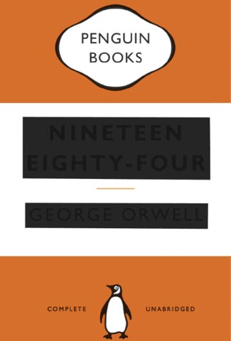
‘Censoring’ the title of Orwell’s 1984 might be witty and appropriate to the story, but you can bet a significant number of readers rushed over just to find out the title of the blacked out book.
Cover design
Do your research, leave your ego at the door and stay minimalist and you’ll end up with a book cover that gets your reader to the blurb. As always the best advice is to sit down with a pen and paper and write out what you want to say, then brainstorm ways you could say it. You’ll be surprised how many simple but creative ideas present themselves when you combine a nail-the-basics approach with research.
If you need help with your cover then our book cover design service might be the perfect fit for you.
Of course once the cover has your reader hooked it’s the blurb’s turn. Try The 5 Core Elements of a Book Blurb (and why you should know them) for advice on the next step. Or for those readers who skip straight to the first page for judgement try The Four Story Openings That Put People Off (and how to avoid them).
What’s your favorite book cover? Are you one of the people who waited for the adult Harry Potter covers? Let me know in the comments.
Five (And A Bit) Books That Will Help You Design The Ideal Book CoverClick To Tweet


2 thoughts on “Five (And A Bit) Books That Will Help You Design The Ideal Book Cover”
I love the minimalistic covers of the big classic books, but also the “repetitive” covers of the series (like “hunger games”), where the only thing that changes is the color.
Hi boostwriter,
I agree. Variations on a theme show a confidence in the initial design that’s very attractive to a reader, and brings out the collector in us.
Best,
Rob